View details
Highlights
Immersive
personalized stories
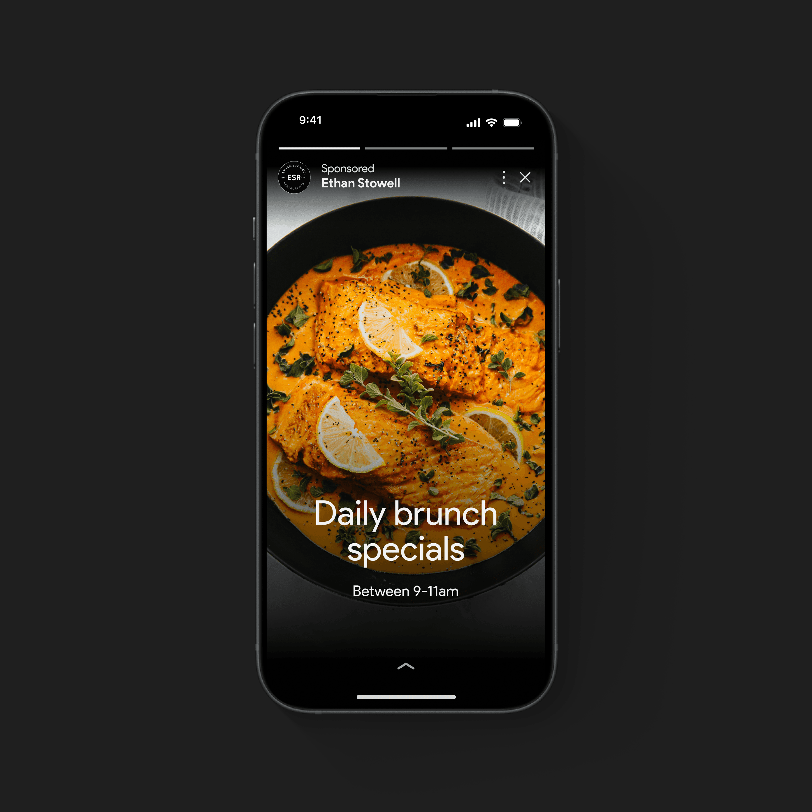
Enabled local businesses tell their story and let the users lean back and get a comprehensive overview of the expected experience.
Structure/ User flow

Highlights with Gemini
Leveraging Gemini's NLP( Natural language processing ), extracted key insights and user sentiment from reviews, presenting them as concise and informative highlights or suggestions.
This approach provided a branded experience through a single, universal viewer while also harnessing the power of visual evidence to build trust.
Ad badging
Real stories from real people breathe authenticity into content, nurturing trust and relatability. When content mirrors the lives of regular individuals, it not only bolsters trust but also bridges the gap between experiences, making them feel attainable.
Ultimate and simple controls ensure effortless use at a comfortable pace.
Easy pathways to related content help users find what they're looking for.
A little bit on the why's
Behind the scene.
A lot of mental quilting to understand what the experience will be like
Users turning towards more visually forward experiences for intangible details missing on the placesheet that is critical to the decision-making process
Users seek subjective information and social proof that is required to find places that are a good fit for their individual needs
Attribution
Users told us that attribution is important for judging information quality, still need to explore/test across more use cases and content types.
Vertical vs Horizontal Scrolling
Vertical scrolling led to more swipes within the viewer for CUJs like inspiration and overall higher engagement, without unintentionally decreasing user satisfaction in the process.
Vertical vs Horizontal Scrolling
The simplest designs were seen by users as the most useful, however, an image alone is not enough. Certain intents require more density of visual and text information and until I am better able to understand intents I was careful about automatically applying a one-size-fits-all approach.
Local stories resonated with users. In our latest UX test with 800 participants, local stories proved valuable for user experience. They provided context for features, offered a structured narrative for complex tasks, added a human touch that fostered user connection, and were especially engaging when presented as moving images.
Let's talk numbers
Bouncing rate decreased by 38% in both food and service verticals.
Conversion rate increased ( Can not share the actual number here)
NPS & CSAT increased significantly.
Time-on-Task decreased specifically on food verticals.
Real local user testimonials

Eva H.
~ Survey Participant, Google Maps
What I mostly liked was the ability to see the location and details in visual form. Since this business was a restaurant, I appreciated the fact that you can see the reviews of the food along with a photo of the food itself.

Daniel Zeru
~ Survey Participant, Google Search
If I want to eat out then I usually do research on Yelp, Google, Facebook, and Instagram to check out restaurants that appeal to me.This feature is helpful because it will consolidate my research and make it much easier.
© 2024 Abel X
Made with care and plenty of coffee


